Border settings
Adding borders to your blocks can really make your content pop! With Qtandard’s border settings, you have the power to customize borders by adjusting their width, radius, and even color for that perfect finishing touch. Let’s dive into how you can easily tweak these settings to make your blocks stand out.
How to find border settings
Finding the border settings is a breeze. Just head over to the Block Settings sidebar when you’re working on a block and click on the ‘Border’ section.
Can’t find the Block Settings sidebar? No worries! Just select the block you want to jazz up and click on the settings icon right next to the Publish or Update buttons in the WordPress Editor.
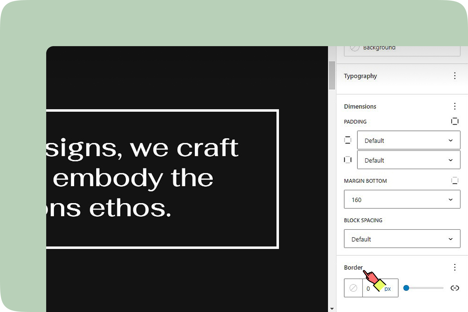
Notice some options are playing hard to get? Tap on the three-dot menu (yep, that’s the ellipsis) in the Border section to reveal all the customizable settings.
Setting border width
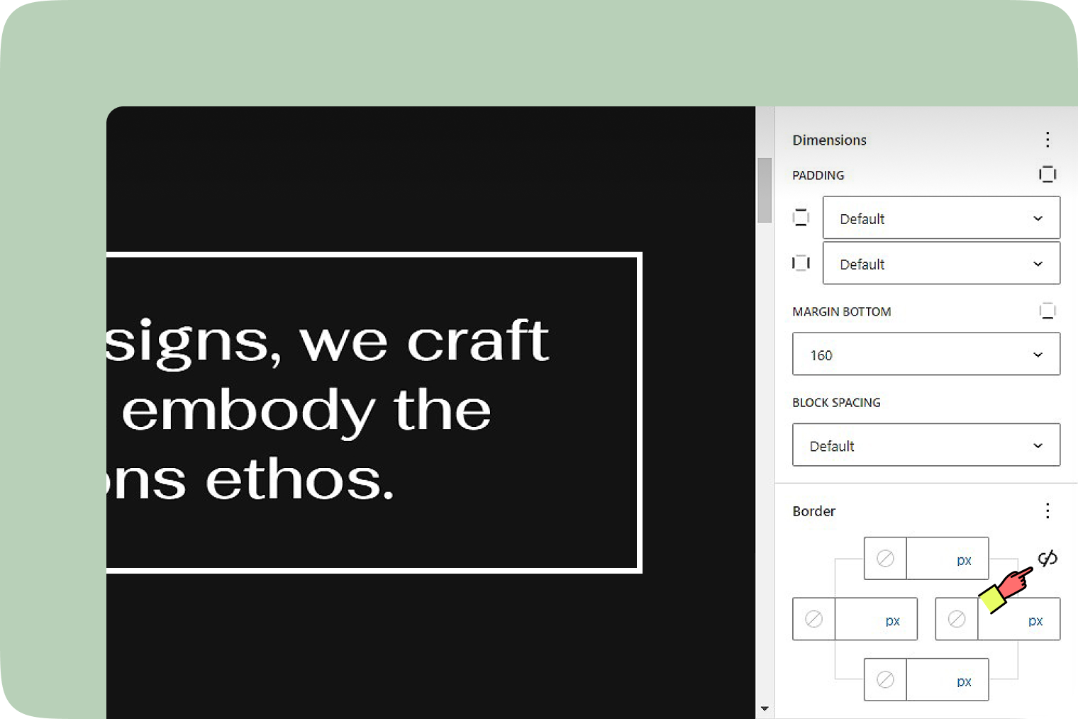
Here’s where things get exciting. You can set the vibe with your border’s thickness. Either punch in your desired width manually or use the slider for quick adjustments. Want to get even more detailed? Click on the Link icon to unlink the sides. This is your key to setting distinct border widths for the top, left, right, and bottom sides of your block, giving you the freedom to create something truly unique.
Setting border color
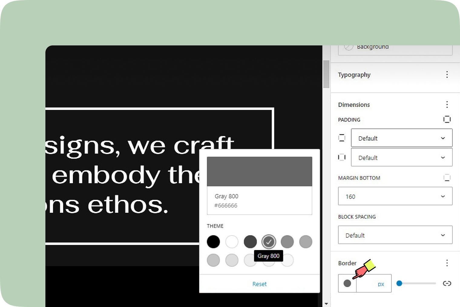
Colorize your borders with ease. The border color setting allows you to pick a hue that complements your design, making your blocks visually distinct. And if you ever want to go back to the original settings, just hit the “Reset” button at the bottom of the color picker. It’s like having a design safety net!
Understanding units
Choosing the right unit for your border dimensions can make your design responsive and look great on any device.
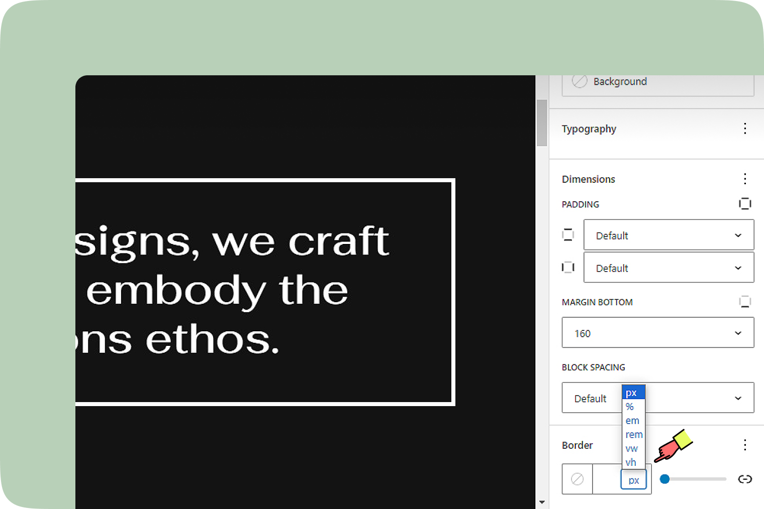
- Pixel (px): Ideal for fixed-size borders that stay consistent.
- Element (em) and Root Element (rem): These are relative units that scale based on parent or root element sizes, making your borders responsive.
- Percent (%): Adjusts the border size relative to the parent element, perfect for fluid designs.
- Viewport Width (vw) and Height (vh): These units let your borders scale based on the viewport size, ensuring your design looks great on all screens.