Buttons
Create engaging call-to-action buttons that guide your visitors and enhance user interaction. Customize the appearance, alignment, and functionality of your buttons to match your site’s design and purpose.
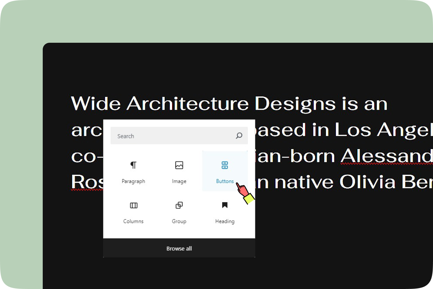
How to add an button block
- Click on the ‘+’ button and choose the buttons block.
- Alternatively, type
/buttonsto quickly add one.
Block toolbar
The Block toolbar for buttons offers a range of options to customize your buttons for optimal user engagement.
Transform to
With the parent button block selected, you can use the ‘Transform to’ button to change your button block into ‘Columns’ or ‘Group’. This feature provides flexibility in restructuring your content layout to better fit your design needs.
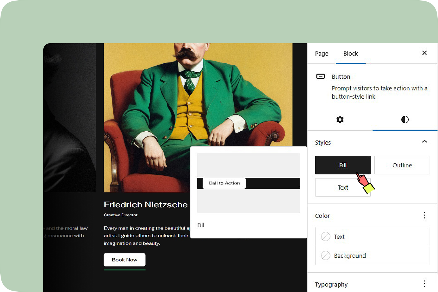
Block styles
There are three button styles you can select: ‘Fill’, ‘Outline’, and ‘Text’.
- Fill: A button filled with color.
- Outline: A button with no fill color, only an outline.
- Text: A text-only button
Drag & Move
Use the six-dot icon to drag your block, or the up and down arrow buttons let you move a block one position higher or lower.
Alignment
The ‘Alignment’ tool lets you adjust the width of your button block. Simply click the icon, and a menu will appear with options. You can set your button block to no alignment, max 1200px wide, or full width.
Items justification
You can justify items in the following ways.
- Justify items left
- Justify items center
- Justify items right
- Space between items
Vertical alignment
Adjust the vertical alignment of your button block with the following options.
- Align top
- Align middle
- Align bottom
- Stretch to fill
Text alignment
The ‘Text alignment’ tool lets you adjust how your text lines up in the button block. Simply click the icon, and a menu will pop up with options. You can align your text to the left, center, or right. This feature helps you easily customize the appearance of your text to achieve the desired look.
Insert links
Easily insert links into your buttons by pasting a URL. This feature allows you to direct users to the desired page or resource with a simple click.
Bold and Italics
The Bold and Italics options are used to customize the text in the button block. You can also use keyboard shortcuts to enable these text formatting.
- Ctrl + B or Command + B to bold the text.
- Ctrl + I or Command + I to italicize the text.
More rich text options
The drop-down menu to the left of the More options menu contains a range of additional rich text editing options such as highlighting, inline code, strikethrough, and more.
More Options
The More options menu represented by three vertical dots on the far right of the toolbar gives you more features such as the ability to duplicate, remove, or edit your block as HTML.
Block settings
Access the block settings from the editor sidebar, visible on the right side panel when you click on the block.
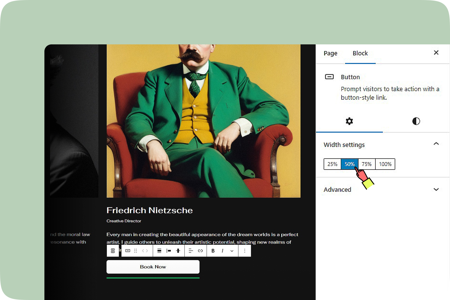
Width settings
You can adjust the button width by selecting 25%, 50%, 75%, or 100%.
Advanced
Add HTML anchors or CSS classes for unique styles or navigation. The HTML anchor settings allow you to create a unique anchor text for the Group block, enabling you to link it to another web page.
Styles
Styles option
- Fill: A button filled with color.
- Outline: A button with no fill color, only an outline.
- Text: A text-only button
Color
- Text: Change the text color of the button.
- Background: Change the background color of the button.
Typography
The ‘Typography’ option allows you to adjust the font size within the button block for better readability and style.
Dimension
You can adjust the padding of the button block to create the desired amount of space around the button.
Border
You can customize the image’s border radius by specifying units such as px, %, em, rem, vw or vh.
Additional resources
- More rich text options
- More options
- Page jumps
- Typography settings
- Dimension settings
- Border settings