Cover
Learn how to use the cover block to add visually engaging background images or videos with overlay text to your content.
How to add a cover block
The Cover block offers a sleek way to combine images or videos with captivating text overlays.
- Click on the ‘+’ icon for block Inserter and choose the cover block.
- Search for ‘Cover’ and click to add it, or simply type
/coverand press Enter.
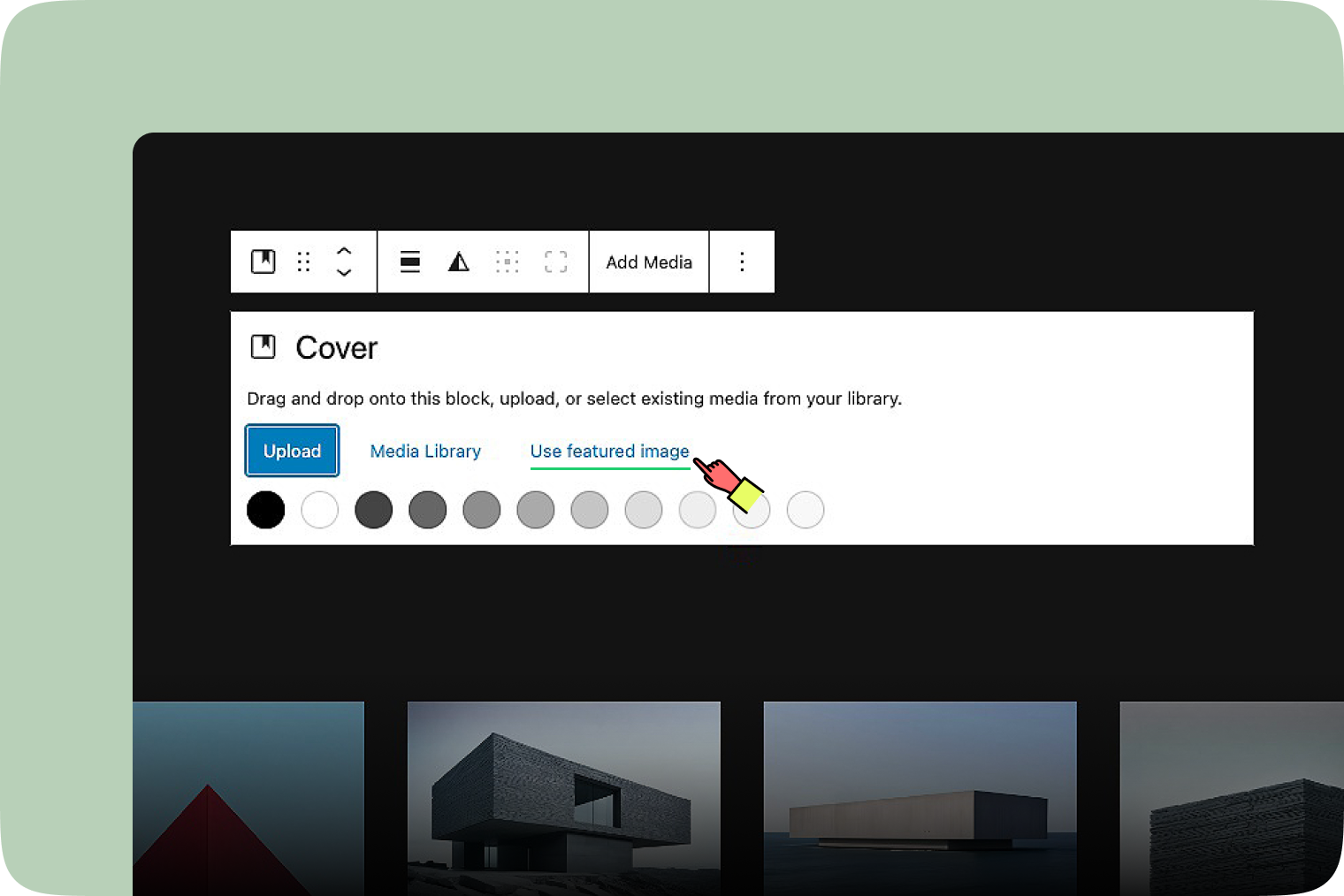
Primary Options
Once you’ve added a Cover Block, here are the primary options available:
- Drag and drop an image onto the block.
- Upload an image directly from your device.
- Select an image from the Media Library.
- Use the featured image for your cover.
- Customize the background color.
Block toolbar
Each block has its own set of tools for customization. Here’s what you’ll find in the Cover block toolbar.
Transform to
The ‘Transform to’ button lets you change an image into other things like ‘Image’, ‘Columns’, ‘Group’ or ‘Media & Text’ easily. This button changes how your text looks so you can make your writing look just right with a simple click.
Drag & Move
Use the six-dot icon to drag your block, or the up and down arrow buttons let you move a block one position higher or lower.
Alignment
The ‘Alignment’ tool lets you adjust the width of your cover in the Cover Block. Simply click the icon, and a menu will appear with various options. You can set your cover image to no alignment, max 1200px wide, or full width. This feature helps you customize your image with ease. Additionally, you can align your image to the left, center, or right, ensuring it looks exactly how you want.
Duotone
Add a duotone filter to apply creative effects to your covers. This feature allows you to create a two-tone color effect without losing the details of your original image.
Content position
You can set the position of the text overlay within the Cover Block. This allows you to place your text exactly where you want it, enhancing the overall design and readability.
Replace
Click the ‘Replace’ button to change the cover. You can select a new image from the Media Library, upload a new one, or use the featured image.
More Options
The More options menu represented by three vertical dots on the far right of the toolbar gives you more features such as the ability to duplicate, remove, or edit your block as HTML.
Block settings
Access the Cover Block settings by clicking on the Cover Block. The settings panel will appear on the right side, allowing you to customize your Cover Block options.
Layout
- Inner blocks use content width: When you turn on the toggle, nested blocks use content width with options for full and wide widths. You can customize the width for all elements assigned to the center or wide columns using units such as px, rem, vw, and vh. If you turn off the toggle, nested blocks will fill the entire width of the container. Toggle to constrain the width as needed.
Settings
- Fixed Background: Toggle to keep the image stationary while scrolling.
- Repeated Background: Toggle to create a pattern by repeating the image.
- Focal Point: Adjust the focal point by dragging the pointer to highlight the main point of interest in the image.
- Alternative Text: Describe the purpose of the image. Leave empty if decorative.
- Advanced: Add HTML anchors or CSS classes for unique styles or navigation. The HTML anchor settings allow you to create a unique anchor text for the Group block, enabling you to link it to another web page.
Styles
- Color Overlay: Choose between ‘Solid’ or ‘Gradient’ color settings for the overlay.
- Overlay Opacity: Adjust the opacity from 0 to 100, with 50 as the default setting.
Filters
You can select the Duotone filter to create a two-tone color effect on your image.
Typography
The ‘Typography’ option allows you to adjust the font size of paragraph within your cover block.
Dimensions
- Margin: Set the margin size to create space around the cover.
- Aspect Ratio: Adjust the aspect ratio to maintain the desired width-to-height proportion.
- Minimum Height of Cover: Define the minimum height for the cover to ensure consistent visual presentation.
Border
- Border size: Customize the border size using units such as px, %, em, rem, vw, or vh. You can also choose the border color.
- Radius: Set the radius to create rounded corners on the cover image using units like px, %, em, rem, vw, or vh.